
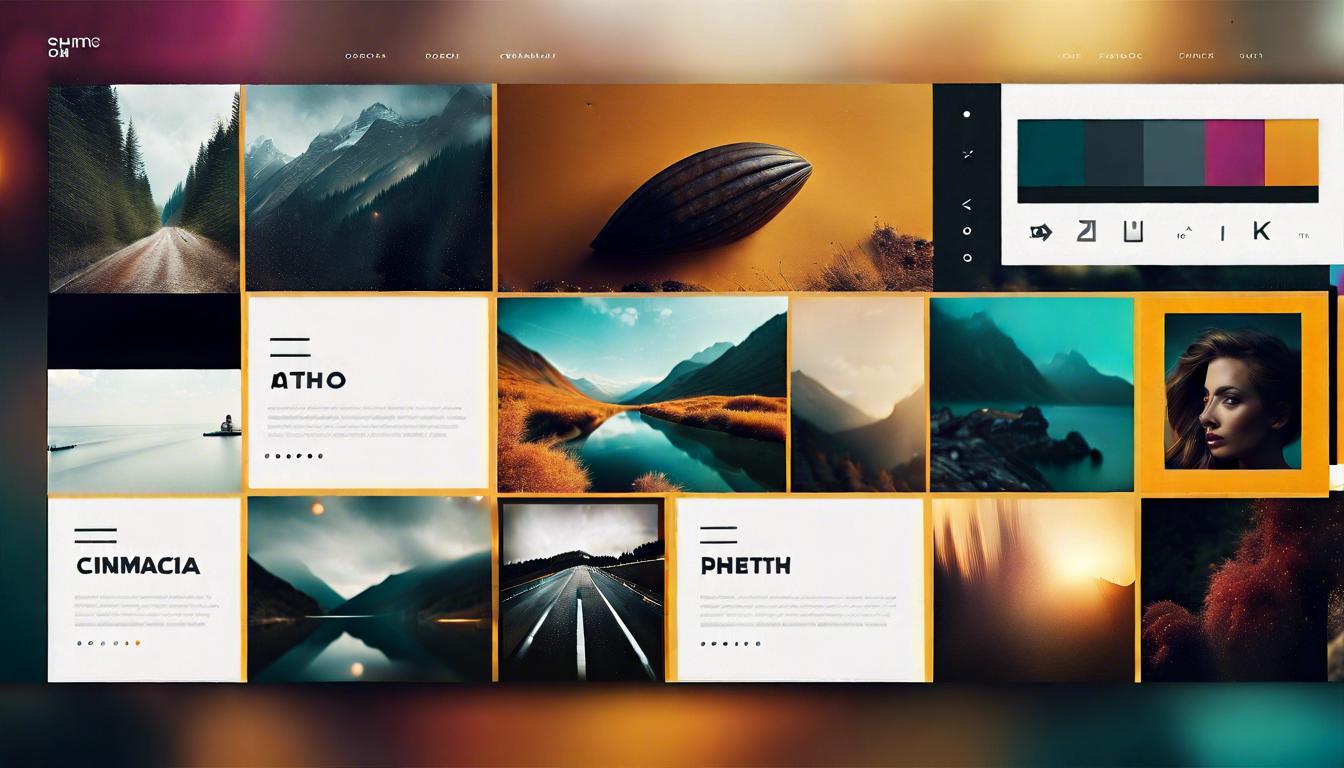
Getting ahead of the curve in web design for 2023 means incorporating cutting-edge trends that not only enhance aesthetics but also improve functionality and user experience (UX). Responsive design remains vital, ensuring your site adapts seamlessly to any device, while mobile-first design prioritizes smartphone and tablet accessibility. Embrace minimalism to keep layouts clean, coupled with dark mode options for user preference. Typography trends are evolving, playing a central role in visual hierarchy and readability. Modernize your site with immersive 3D elements and parallax scrolling, lending depth and interactivity. Asymmetrical layouts paired with grid systems create dynamic yet organized visuals.
Enhancing user interaction through micro-interactions and motion UI, your site can feel more engaging and lively. Custom illustrations and animation techniques further personalize the experience. Colors play a crucial role; understanding color theory can lead to more impactful designs, particularly with gradient backgrounds and white space usage. For a streamlined experience, single-page design and modular design are becoming increasingly popular. Ensure accessibility and a solid user interface (UI) to cater to all users, including those with disabilities. Finally, stay ahead by integrating innovative features like augmented reality (AR), voice user interfaces, and immersive storytelling to make your site unforgettable.
Embracing minimalism in web design can significantly enhance user experience (UX). By removing unnecessary elements, you allow your content to shine and reduce distractions for visitors. This approach promotes a clean, uncluttered layout that helps users focus on the essential parts of your site. Minimalism also pairs well with white space, which improves readability and guides the viewer’s eye through your design with a clear visual hierarchy.
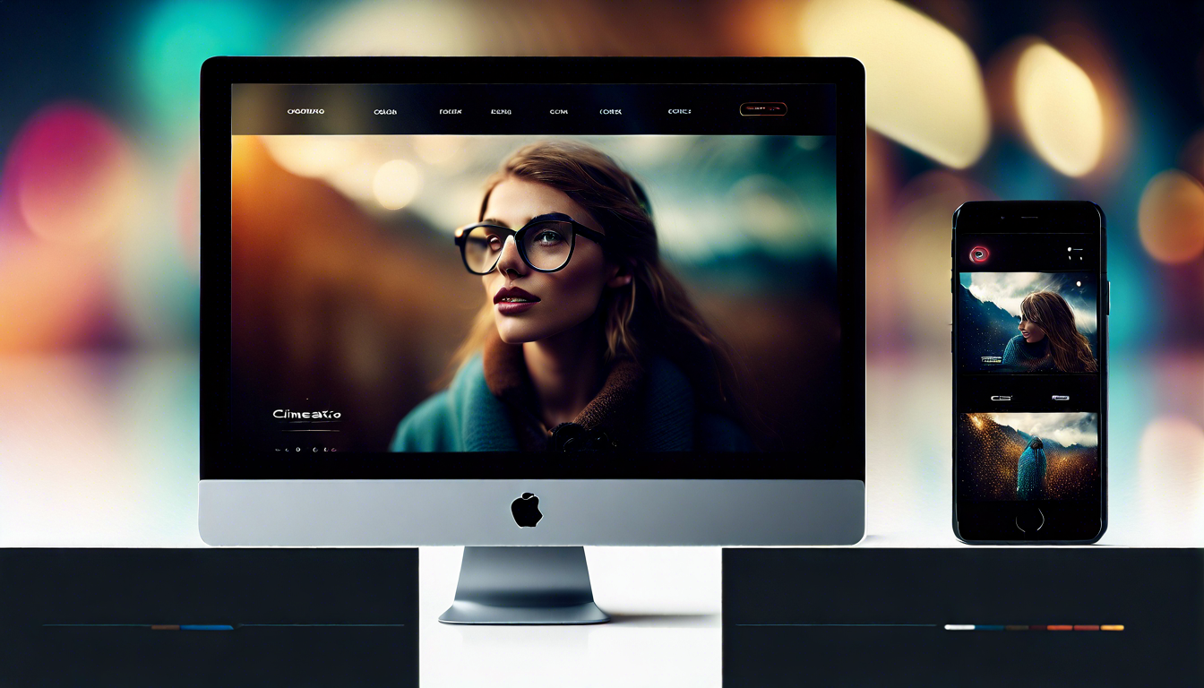
Adaptive design is a key aspect of minimalism, ensuring your site appears seamless across different devices. Responsive design complements this by making navigation intuitive, regardless of screen size. Mobile-first design further underscores the importance of creating for smaller screens first, which often leads to more streamlined, efficient designs. You can also incorporate dark mode options, offering a sleek, modern aesthetic that aligns with minimalistic principles.
On one hand, some designers see minimalism as a way to enhance focus and performance, while others argue that it can sometimes feel too sparse and lacking in personality. To strike a balance, incorporate elements like custom illustrations or subtle micro-interactions that add character without overwhelming the overall simplicity. Using color theory effectively, along with gradient backgrounds, can also inject subtle vibrancy into a minimalistic design without compromising its core principles.
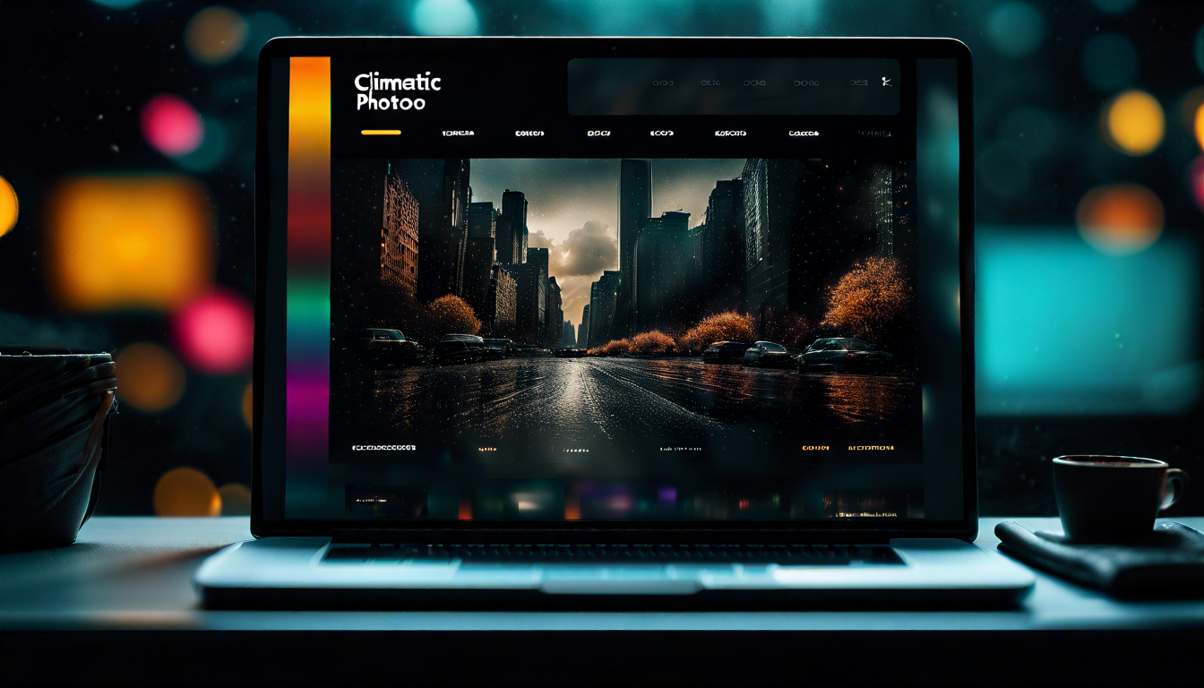
Dark mode has become an essential feature in modern web design, offering a sleek and visually appealing alternative to traditional light modes. This design trend not only enhances the aesthetic appeal but also aids in reducing eye strain for users, especially in low-light environments. The popularity of dark mode is further supported by the flexibility it provides in emphasizing other elements, such as typography trends and immersive 3D elements, ensuring content remains visually appealing and readable.
Responsive design takes on a new level of importance with dark mode, as it must adapt seamlessly to different screen sizes and devices. According to recent studies, the reduction in blue light exposure when using dark mode can improve sleep patterns and reduce digital eye strain. This scientific finding explains how dark mode’s benefits extend beyond just aesthetics, contributing to better overall user health when navigating websites at night.
From a UI perspective, incorporating dark mode aligns well with minimalism and contemporary design practices. It creates a sophisticated visual hierarchy, often complementing flat design and modular design principles. Thoughtful use of white space and gradient backgrounds within dark mode can further enhance the visual experience, making your site not only more attractive but also easier to navigate, which significantly improves UX.
Additionally, leveraging animation techniques and micro-interactions in dark mode interfaces can make your site feel more dynamic and engaging. Elements like parallax scrolling and motion UI can be effectively highlighted in dark environments, while maintaining a consistent and accessible design system. As dark mode continues to gain traction, ensuring its seamless integration into your web design strategy could be a game-changer for maintaining a modern and user-friendly site.

Incorporating interactive and dynamic content in your web design can significantly boost user engagement and retention. By using elements like micro-interactions, parallax scrolling, and motion UI, you can create a more immersive experience that captivates users. These features not only make your site visually appealing but also improve user experience (UX) by providing intuitive feedback and seamless navigation. Employing animation techniques and custom illustrations can further enhance the storytelling aspect of your website, making it more memorable.
The current state of web design shows a clear trend towards incorporating more interactive elements that engage users in meaningful ways. Adaptive design and responsive design ensure that these dynamic components work smoothly across various devices, enhancing accessibility and usability. By integrating immersive 3D elements and augmented reality (AR), you can offer unique, memorable experiences that stand out. Asymmetrical layouts and grid systems also play a role in making interactive content feel more dynamic and less predictable, adding an element of surprise and delight.
With the rise of mobile-first design, creating content that is both interactive and optimized for smaller screens is becoming increasingly crucial. Single-page design and card-based interfaces are also gaining popularity, providing a streamlined yet engaging experience. Color theory and gradient backgrounds can add depth and vibrancy, while voice user interfaces offer hands-free interaction options. By focusing on these trends, you can create a site that not only attracts but also retains visitors, enhancing your overall user interface (UI) and user experience.

Integrating AI and machine learning into web design is transforming how we create and interact with websites. These technologies allow for personalized user experiences by analyzing user behavior patterns and preferences. AI can optimize layouts, choose appropriate typography trends, and even suggest color schemes based on color theory, improving overall user experience (UX). Machine learning algorithms can also assist in creating dynamic content that adapts in real-time to the needs and preferences of your visitors.
One unpopular opinion about AI in web design is that it may reduce the need for human creativity, leading to more standardized and less innovative designs. However, AI can actually enhance creative possibilities by automating mundane tasks and providing new tools for designers. For instance, adaptive design and responsive design can be more efficiently implemented with AI, ensuring that your site works seamlessly across various devices. Animation techniques and motion UI become more intuitive, guiding users naturally through different parts of your site.
Voice user interfaces are another area where AI shines, providing hands-free navigation and improving accessibility. For mobile-first design, AI can help tailor the user interface (UI) to different screen sizes more effectively. Custom illustrations and micro-interactions can be enhanced with machine learning, making them more relevant and engaging. AI can also optimize grid systems and asymmetrical layouts to improve visual hierarchy and ease of navigation, creating a more user-friendly environment.
AI and machine learning also play a significant role in adaptive and immersive 3D elements, contributing to more interactive design experiences. By incorporating augmented reality (AR), you can offer users an engaging way to interact with your content. AI can analyze user data to offer personalized recommendations and adjust content dynamically, thereby improving user engagement and satisfaction. Single-page design and modular design can both benefit from AI's ability to optimize loading times and content display.
In essence, integrating AI and machine learning into your web design strategy offers a plethora of benefits. While some may view AI as a potential threat to creativity, it actually provides tools that can elevate your design to new heights. From optimizing visual hierarchy and dynamic content to enhancing overall user interface (UI) and user experience (UX), AI is poised to be an invaluable asset in the future of web design.
Voice user interface (VUI) design is becoming more prevalent as voice-activated devices like smartphones and smart speakers permeate everyday life. Implementing VUI requires careful consideration of user experience (UX) and user interface (UI) principles. The goal is to make voice interactions seamless, intuitive, and accessible. You need to optimize your site’s design systems to ensure that voice commands are accurately recognized and properly executed.
One of the most frequently asked questions about VUI design is: "How do you ensure accessibility in voice user interfaces?" Here’s the answer: Accessibility in VUI can be enhanced by incorporating clear voice prompts, providing alternative input methods, and ensuring consistency in voice responses. This approach not only helps users with disabilities but also those in diverse environments, further emphasizing the importance of inclusive design.
For responsive design, VUI should adapt effortlessly to different devices, from mobile-first design on smartphones to more complex systems in smart home devices. Minimalism plays a crucial role in VUI, as it helps streamline user interactions, keeping voice commands straightforward and effective. By integrating motion UI and micro-interactions, you can provide users with visual feedback that complements voice commands, strengthening the overall user experience (UX).
Incorporating advanced technologies like augmented reality (AR) and immersive 3D elements can elevate VUI design, making interactions more engaging. For example, parallax scrolling and modular design can be adapted to work well with voice commands, providing a more dynamic and interactive user experience. By keeping abreast of typography trends and color theory, you can ensure that visual elements complement auditory feedback, creating a harmonious and functional design.

Incorporating augmented reality (AR) into web design can create immersive, interactive experiences that captivate users. By blending digital elements with the real world, AR enhances user engagement and offers new ways to interact with content. Responsive design is crucial when integrating AR, ensuring that these elements function seamlessly across various devices, from desktops to mobile-first designs. The addition of immersive 3D elements and effective motion UI can further elevate the user experience (UX), making your site more dynamic and interactive.
A closer look at IKEA's experience with AR reveals its potential in web design. IKEA's AR application allows users to visualize furniture in their own homes before making a purchase. This practical application of AR not only enhances the shopping experience but also boosts customer confidence and satisfaction. Such case studies demonstrate how AR can effectively bridge the gap between digital and physical spaces, creating highly personalized and engaging user experiences.
To integrate AR successfully, it’s essential to maintain a balance between functionality and design. Minimalism and flat design principles can help keep the interface clean and user-friendly, ensuring that the AR components do not overwhelm the user. Using white space effectively, along with gradient backgrounds, can highlight AR elements without causing visual clutter. This approach ensures a cohesive and aesthetically pleasing design.
Incorporating AR also demands a solid understanding of visual hierarchy and interactive design principles. Ensuring accessibility and adaptive design will make AR features usable and enjoyable for a wider audience. By integrating AR with storytelling and animation techniques, you can create memorable, engaging narratives that keep users coming back. Parallax scrolling and grid systems can further organize AR content, making it intuitive and easy to navigate. This combination of techniques will help you create an innovative and captivating web design.
Get free resources, tips & tricks, exclusive news, and special offers by joining the Cryptonite Newsletter.


.svg)